I have compiled a list look book of my favourites.
Naeem Khan - Fall 2011


Naeem Khan's inspiration was based on a subtle Silk Road. I just love the last image in which he uses the laser cut, patent leather flowers. Each of the flowers are dotted with sequins which have all been hand-sewn onto the red satin number that opened the show. The ostrich feathers added for an extra special texture that stunned the catwalk. It almost seemed like the dresses were floating with the feathers, utterly delightful.
Matthew Williamson - Fall 2011


Matthew Williamson's inspiration cited his inspiration as Francisco Infante-Arana, the Russian artist who photographs mirrored sculptures in various landscapes, creating a fun-house version of the natural world. These fabulous sharp prints and texture are right up my street. My final project I am working on right now for uni involves a lot of optical art and I think that Williamson's latest collection pulls it off fabulously! Being one of my favourite designers I very much look up to him and his designs. It is definitely a good change to see some sharp prints from Williamson as his last Resort collection was very soft and to be honest not one that I was too crazy about. I can still see his signature coming through, his fabrics are still very much lightweight aside from the ombré Mongolian lamb chubbies. Also there seems to be a fascination with feathers and this seasons designers.
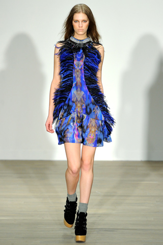
Holly Fulton - Fall 2011


Mary Katranzou - Fall 2011


The designer backstage today said, "It's more fluid, more real." Even so I think that this collection was just as jaw droppingly beautiful as her Spring collection. This was because Katrantzou imagined the woman as a connoisseur, surrounded by objects of beauty like Fabergé eggs, Meissen porcelain, cloisonné enamel, and Ming vases; all of them were reproduced in hyper-vivid prints. The colours are absolutely spectacular mixing solid prints with fluidity just like the water surrounded by the koi in one print where they all seem like they are swimming before your eyes.
Talking about her choice of silhouettes things got more interesting when the designer softened her silhouette. "It's hellishly difficult to put a placement print on a bias-cut dress," she sighed backstage. Katrantzou's silhouettes were taken from the haute couture wardrobes of their imagined owners. (The names of legendary style icons like Diana Vreeland, Babe Paley, and the Duchess of Windsor). Even though Katranzou developed her designs in this way they still seem a stones throw away from the lamp shade inspiration in her last Spring collection.
0 comments:
Post a Comment